Nonfiction Picture Book Wednesday is hosted by Aly at Kid Lit Frenzy.
Every Wednesday, bloggers link up their non-fiction picture book reviews. Be sure to visit Kid Lit Frenzy and see what great non-fiction books are shared this week!
Every Wednesday, bloggers link up their non-fiction picture book reviews. Be sure to visit Kid Lit Frenzy and see what great non-fiction books are shared this week!
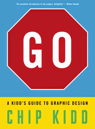
Title: Go: A Kidd's Guide to Graphic Design
Author: Chip Kidd
Publisher: Workman Publishing Company
Publication Date: October 8th 2013
Genre/Format: Non-Fiction/Picture Book
GoodReads Summary: “An excellent introduction to graphic design through [the author’s] own excellent work. Anyone interested in the subject, including most practitioners, will find it delightful.”—Milton Glaser
Kids love to express themselves, and are designers by nature whether making posters for school, deciding what to hang in their rooms, or creating personalized notebook covers. Go, by the award-winning graphic designer Chip Kidd, is a stunning introduction to the ways in which a designer communicates his or her ideas to the world. It s written and designed just for those curious kids, not to mention their savvy parents, who want to learn the secret of how to make things dynamic and interesting.
Chip Kidd is the closest thing to a rock star in the design world (USA Today), and in Go he explains not just the elements of design, including form, line, color, scale, typography, and more, but most important, how to use those elements in creative ways. Like putting the word go on a stop sign, Go is all about shaking things up and kids will love its playful spirit and belief that the world looks better when you look at it differently. He writes about scale: When a picture looks good small, don t stop there see how it looks when it s really small. Or really big. He explains the difference between vertical lines and horizontal lines. The effect of cropping a picture to make it beautiful or, cropping it even more to make it mysterious and compelling. How different colors signify different moods. The art of typography, including serifs and sans serifs, kerning and leading.
The book ends with ten projects, including an invitation to share your designs at GoTheBook.com
What I Think: I absolutely love this book. I found it fascinating from beginning to end. Design thinking has been on my mind since I participated in Understanding by Design training in July. As I've been talking to more and more people this year about blogging, I find myself telling them that they can set up a simple blog and that I've been working on mine, tweaking the design, moving things around, changing the layout and the theme for a long time now. My blog has evolved over time and I've had fun tinkering with it. I've been working on a website for a couple months now and I haven't made it live yet because I'm not happy with what it looks like and how it represents me just yet.
This book helped me see and name some of the thoughts that go through my head as I've worked on my blog and website but I also notice this extends into my writing as well. I saw a great example of varying sentences the other day on Twitter. It showed a version of a paragraph with the sentences basically saying the same thing with sentences of similar structure and then a paragraph with sentences of similar content but with varying sentence structure to show how much more lyrical it is. As writers we design with words and I think that's what makes it an art.
I honestly could go on and on about this book, what I learned and how it made me think. There were definitely some new design ideas that I'm looking forward to trying. I love that there are ideas here that gave me a concrete way to be creative. So often creativity seems abstract and innate but this book made it feel like it's possible to learn to be creative and I think that might be a relief to some students.
As a mentor text, I grabbed a snatch of text from the very beginning when the author is talking to the reader. Looking closely at attention grabbers or hooks in non-fiction writing is so much fun. Kidd doesn't disappoint. I really enjoy how he uses 2nd person. It's not very often that 2nd person is used but I think it's a great example of how to hook a reader. I listed a few other books that use 2nd person and/or have great hooks as books that would match well with this.
One more thing...at the end of this book, there is a great extension for students. After reading about all of the design ideas outlined in the book, Kidd offers some projects that students can try. Bonus!
Read Together: Grades 3 - 12
Read Alone: Grades 4 - 12
Read With: Extreme Earth by Seymour Simon, Locomotive by Brian Floca, Choose Your Own Adventure books
Snatch of Text:
"CONGRAT-
ULATIONS,
you have decided to open
this book, even though you
have no idea what it's about
because the cover doesn't
tell you much. In fact, the
cover is weird and seem-
ingly at cross-purposes
with the message and pos-
sibly even a bit pretentious.
But you opened it anyway."
Writing Prompts: Complete one of the projects at the end of the book and then write about what you thought about as you completed the project and how you felt about being a designer.Topics Covered: Integration - Art, Creativity, Intentionality, Purposefulness, Motivation, Belief


No comments:
Post a Comment